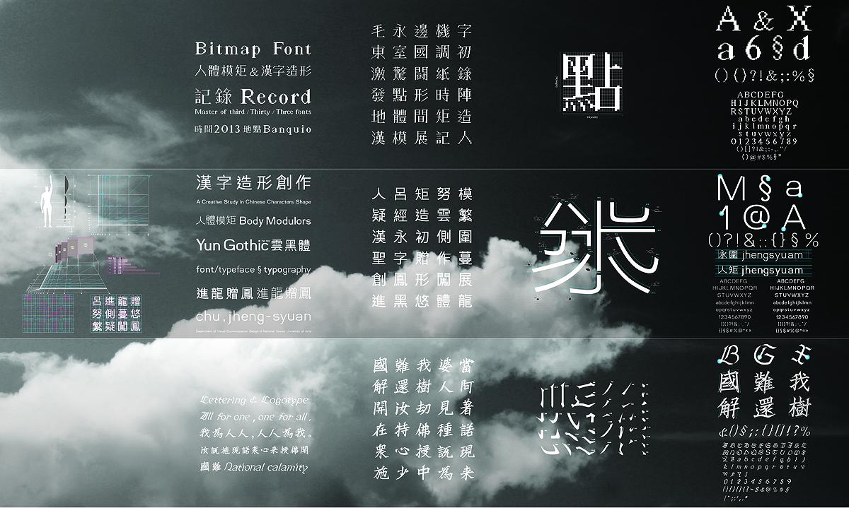
For a graphic designer, typeface is always a key element either as an information carrier
or a purely tool for visual presentation. But for most of the designers, the only work to do
with typeface is to choose an appropriate font for it while having not very-depth
understanding with the basic strokes and structures.
The most difficult part of Chinese character design is the structural complexity. Its
formation characteristics made each typeface have its stable and balanced issue which likes a
tiny building. This study applies the modular principle which is used to calculate architecture
proportion to constitute the configuration method of Chinese character since the modular can
be a measurement system for controlling length, surface and amount, and also because of its
innate sense of harmony. The researcher here chose the blue series number of modular and put
Taiwanese average height, navel height and the fingertip height when arm straight up high to
create a new set of modular series which will be the design principle and modify basis for
Chinese character. In this study, in turn created three different typeface with gothic,
regular script and bitmap font, the purpose the one two typeface is to complete the
way to the screen, respectively, at high and low resolutions presented, and the regular
script retro work is based on calligraphy, point out the history of Chinese character
culture and values.
Different typefaces would bring different emotional expressions after being arranged
and recombined. Even with the structure balance and stabilization standard, an article may
still bring audience rigid, dull reading experience. Therefore, there comes another lesson
which is how to trace stable and active sense to provide discrimination while reading.